Red Canoe
Always On Your Side
As Red Canoe Credit Union expanded into new markets, it needed more than branch growth — it needed brand clarity. Through strategic research and refinement, JayRay helped define a clear campaign platform and scalable identity system rooted in what makes credit unions different. The result: a warmer, more visible and more confident member-first brand ready to grow without losing its heart.
GUIDING THOUGHT
Credit unions often promise difference, but many look and sound like banks. To stand apart, Red Canoe needed to embody its values, not just state them. By clarifying its archetype as The Friendly Navigator, the brand could consistently express guidance, trust and member-first purpose across every touchpoint.

A Brand with Direction
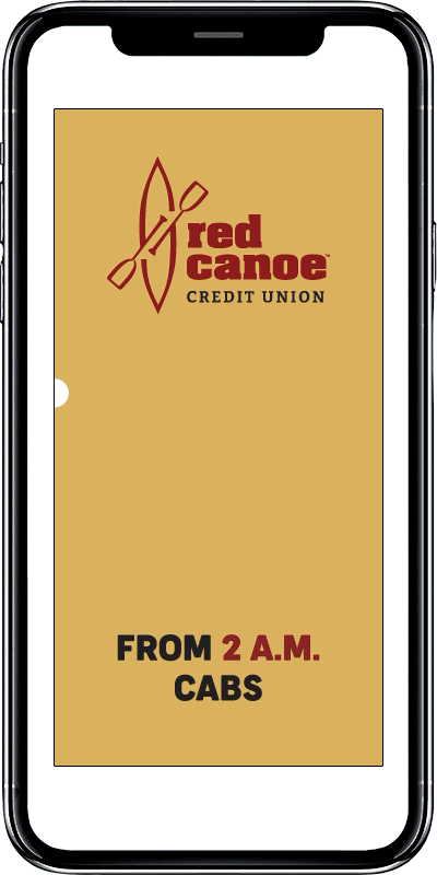
We anchored the campaign in a simple truth: Always on your side. Messaging evolved from lines like “The bills don’t stop, and neither do we” to “Here for you, not for profit” — reinforcing Red Canoe’s commitment to members over margins.
Beyond the campaign platform, we refined the logo to elevate the words “credit union,” ensuring clarity and visibility in competitive markets. A full brand toolkit followed, including voice guidelines, design standards and a flexible visual system built to scale across branches and channels.

Strategy Before Splash
Research led the way. We tested messaging, differentiators and tone to uncover what truly resonated. That work revealed the power of positioning Red Canoe as a steady, supportive guide — not a financial giant, but a trusted partner.
Working closely with internal teams, we translated strategy into action across digital ads, outdoor placements, landing pages and in-branch materials.

Results: Enduring